We’ve all seen them. Those questionable sites that throw a smattering of popups and lightboxes and offers at us in an attempt to reel us back in. We simply can’t go unless we get their free e-book, sign up for their newsletter, or we’re otherwise happy with the situation that caused us to click them in the first place.

Because nothing says “Make Money Online!” like disembodied happy people!
But why resort to these kinds of last-ditch effort techniques at all? Most usability experts would have you roll out the red carpet to your prospects and pepper them with deals and discounts, but I’d like to propose a different idea – getting them so accustomed, familiar and eager to do business with you gradually – until it seems so easy and convenient, they’ll wonder why they didn’t think of it in the first place.
This process is known as User Onboarding, a term coined by designer Samuel Hulick. The story goes that Samuel was considering using online accounting service LessAccounting, but he struggled during the sign up process – so much so, that he wrote a review about it on his site. It was useful and informative, but didn’t back away from necessary criticisms either. Word spread to LessAccounting’s co-founder, who (much to Samuel’s surprise) was thrilled with the review and started making the necessary changes on the site right away.
The original video “tear down” review of LessAccounting
So how can you leverage the user onboarding process for your own site and get prospects to go from casual browser to engaged buyer? And how does this differ from other techniques like remarketing? Let’s take a closer look at some techniques you can put to use right away.
The Key Difference Between User Onboarding and Remarketing/Retargeting
Both remarketing and user onboarding have a lot of similarities. They’re both encouraging users to take the next step toward a conversion. However, the user onboarding process involves much gentler guidance, whereas remarketing is more of a nudge – it could be welcomed, as in “oh! I forgot I had that in my cart!” or a mild annoyance, as in “I abandoned my cart because the price was too high – leave me alone!”
So how do you walk the line between (un)welcome reminder and gentle guidance?
Let the User Make Purposeful Progress
If you have a considerable number of steps in your sign up or registration process, using progress indicators can help. Progress indicators are non-intrusive, and give users a meaningful goal to reach. Many apps, services and memberships leverage progress bars to give users a clear indication of where they are in the process, how many steps are remaining and how to continue.
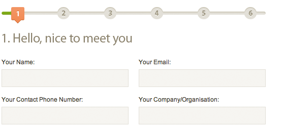 Progress steps give the user a clear indication of what’s next – and a goal to move toward
Show Them What They Get (Instead of What They Don’t Get)
Many sites use feature comparison charts as a way to show users the differences between packages and pricing. Oftentimes you’ll have a scattering of green checkmarks and red X’s to show what’s included. But what if you only concentrated on the positive by showing users what they get, as opposed to what they don’t get?
Vonjour, a phone and text messaging service, does this with their plans. This not only alleviates the pain points of “look how restrictive this package is” but gets users excited from a value standpoint with “look at all the things that are included!”
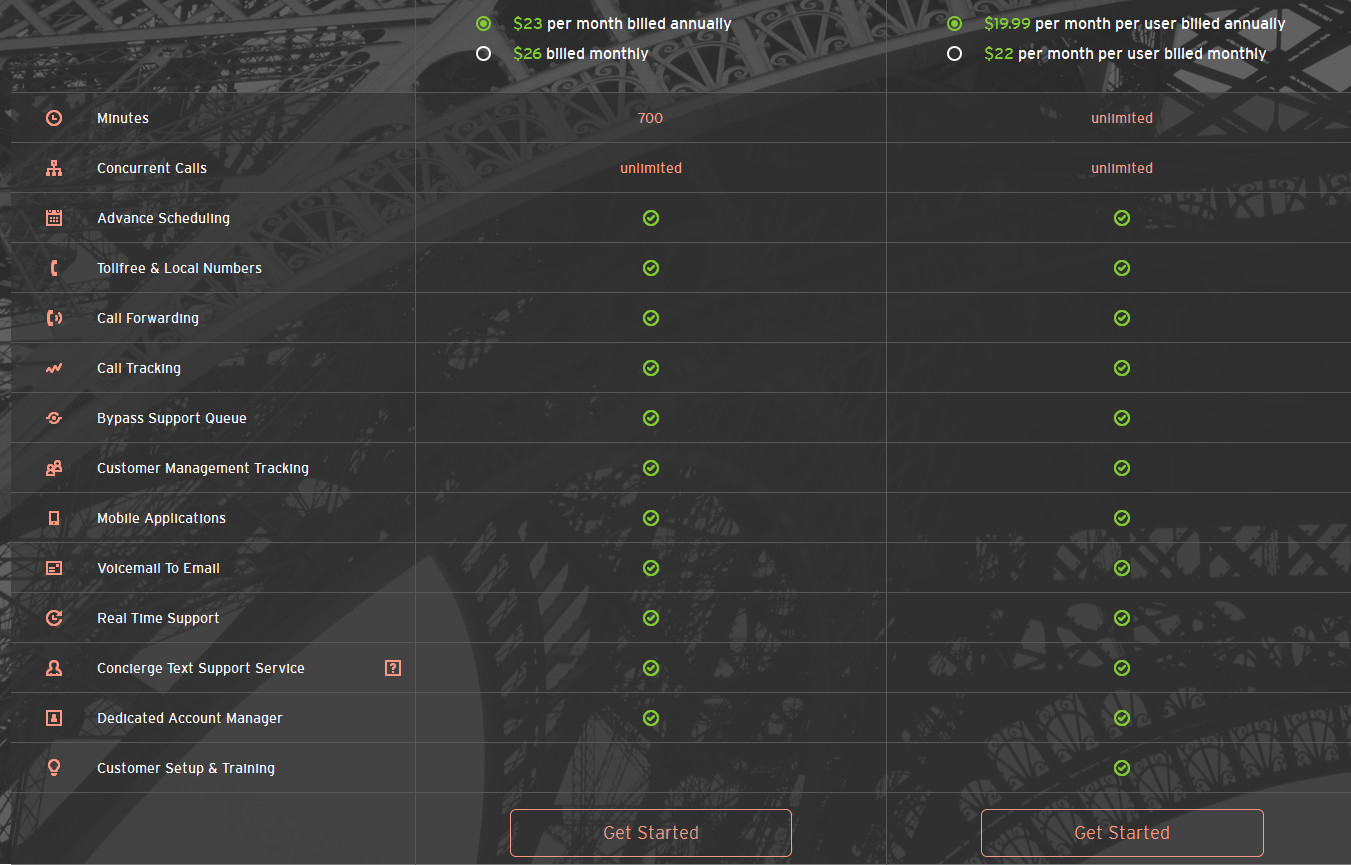
Just look at all the features you get!
Be Careful With Settings and Controls
If you want to improve the user experience with your app, system or software, be careful about giving the user too much control, too soon. While it’s possible that most users will want to dive right in and play around, oftentimes, cumbersome tooltips, popups and other instances will clamor for their attention instantly. It can be almost instinctive to click the “do not remind me again” box and then forget where to go to pick back up the process later.
Dell’s LivePC does a good job of reminding the user without being too insistent or interruptive, by giving them several options to choose from for a reminder.
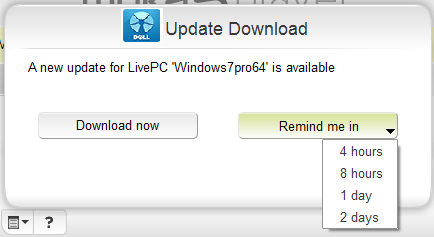
Live PC lets you pick a reminder time that’s convenient for you
Microsoft, however, failed to get the memo:
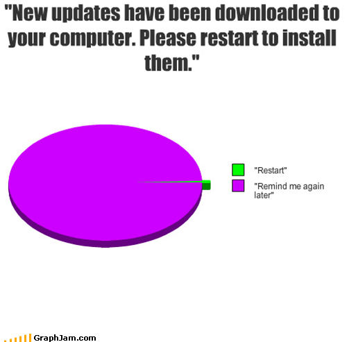
Still waiting for that “Don’t Remind Me Again” button…
View the Process from the User’s Perspective
What happens after the user clicks your call to action? For many sites, users are directed to the next step or feature that the service assumes is the best choice for them. It can seem like a no-brainer to propel the user toward embracing certain features – after all, those are the very things that set your service, app or product apart.
However, remember that from the user’s point of view, all of these questions and features can seem confusing or unnecessary. From their perspective, asking them to “tell us your email address (so that we can customize your experience)” or “Give [service] permission to access your email contacts” are more uncomfortable and intrusive than helpful. “Customize your user experience” – what does that even mean? How will you customize it? How will you help me to do the very thing that caused me to sign up with you in the first place?
If you can’t answer that question – users will simply give up and turn their account into a ghost town.
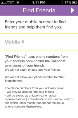
Look at how SnapChat handles this request in a more human way – “Do this, so that we can help you do that” – Enter your phone number so that we can help your friends find you (and vice versa)
In addition, the less barriers to entry you can throw up in the user adoption process, the higher your conversion rate can be. Our own KISSmetrics login system uses Google to circumvent the creation of yet-another-username-and-password which can be distracting and herd the user away from the original goal. As a result of using this social login system, our conversion rate ranged from 44-82%.
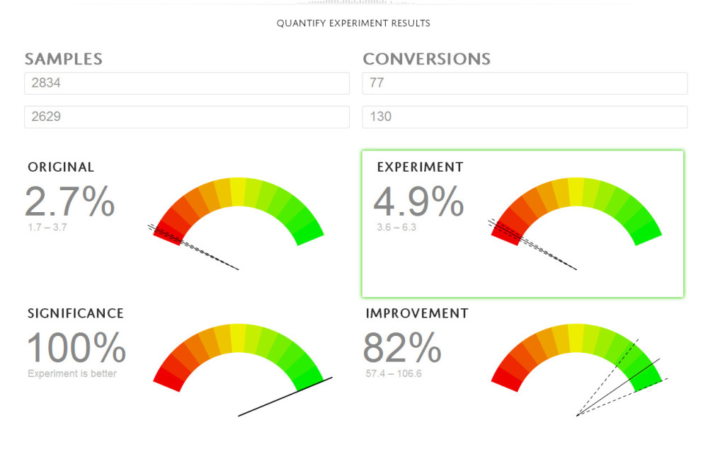
KISSmetrics achieved an 82% improvement in user onboarding by using a social login system
The Final Thought on User Onboarding
As a general rule, the more human, open and friendly you can make the process – whether it’s a demo, a login or a tool, the more people will be willing to take the next steps. Remember, people are more likely to do things that are in their best interest and benefit immediately, rather than waiting and hoping they have the opportunity to go back at a later date. Once you have their attention, treat it like the precious commodity it is and work with them to turn them from casual users into brand evangelists!
Have you spotted a great example of user onboarding? Tell us about it in the comments below!
About the Author: Sherice Jacob helps business owners improve website design and increase conversion rates through compelling copywriting, user-friendly design and smart analytics analysis. Learn more at iElectrify.com and download your free web copy tune-up and conversion checklist today!
No comments:
Post a Comment